National Children's Science Centre's New logo unveiled
- NCSC Ireland

- Jan 23, 2024
- 2 min read
Updated: Feb 11, 2024

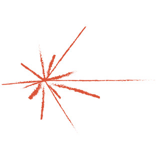
We are delighted to unveil our new Pulsar Logo. There's a very interesting story behind it, so we thought we'd share it with you.
Our graphic inspiration is the Pulsar Map from the Golden Record on the Voyager spacecraft. Astronomer and astrophysicist Frank Drake designed the map, working with fellow astronomer Carl Sagan and artist and writer Linda Salzman Sagan.
Here is a picture of the Golden record, courtesy of NASA. The starburst-like diagram that you can see on the bottom left hand corner is called a pulsar map. It shows the location of our sun relative to known pulsars.

Pulsars are the rapidly spinning remains of dying stars—the leftover cores of supernova explosions. They are only about 12 to 15 miles in diameter, but most contain more than twice the mass of our sun.
Their rapid spin and intense magnetic fields cause the pulsars to emit very specific wavelengths of light, which flash like the beam from a lighthouse every time they pass across our field of view.
Each pulsar has its own signature pulse rate, making them easy to identify, and ideal as reference points on a map. Frank Drake used 14 pulsars to create a map with our sun at the centre. Each pulsar is connected to the sun by a solid line. The length of the line represents the pulses approximate relative distance from the sun.
Pulsars were discovered by one of Ireland's greatest scientists. Professor Jocelyn Bell Burnell from Lurgan discovered pulsars in 1967 while she was a postgraduate student at Cambridge University.
The image connects us to humanity's farthest journey, a piece of our curiosity travelling since 1977 and still teaching us. Our graphic is dynamic and messy, giving a sense of explosion, a spark of curiosity, of excitement, discovery.
So, there you go. Now you know the story behind our new logo. We hope that you enjoy it as much as we do!


Comments